In a former life, many years ago when I was a young, clean-shaven web designer learning my trade in a world that existed before user experience was a thing in digital design (we're talking pre-iPhone, pre-Facebook, even pre-Dotcom boom and bust of 2000/1) – I was an arrogant designer.
I'm not ashamed to admit it. It has since had a significant influence over my career development and who I am today. It was around this same time when there was an early, notable shift in the wider digital industry towards User Experience (UX), using data & analytics and research to inform design. Thankfully, I realised quickly what I was doing wrong and how to correct the errors of my ways.

The evolution of digital design
The digital design industry has evolved considerably. When I started out, the proven path to development was based on assumptions. I/We had to make assumptions. We guessed what users wanted. We put plans in place about how and where our emergent solutions would develop over a 6 to 12-month period.
The 'internet' was still in its infancy. Data to inform us about human interaction and behaviour with digital platforms was non-existent. Although internet usage had started to take off, the early adopters were tech-savvy individuals and didn’t represent the wider business or consumer user bases we have today.
You have to look back at the websites available in 1999 to appreciate how embryonic the core underpinnings we have in today's digital world were. The web browsers of choice back then included Netscape 4 and the newly launched Internet Explorer 5 (IE5). Macromedia (Adobe) Flash was beginning to gain in popularity.
The technology and standards compliance we built against and the methods of delivery to users constrained us. Every page I built back then was done using <table>'s and inline attribute styling. Cascading Style Sheet (CSS) support across browsers was shocking.
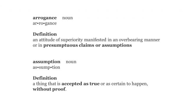
It was in late 2001 when I woke up and saw the error of my ways. I had been basing the design of products and services on my own assumptions and those of others. Assumptions are arrogant and dangerous, often the tipping point between success and failure.
What’s in a word?
 For me, the key element of the definition lies within the 'assumption' being accepted as true and without proof.
The arrogance that changed everything (for me!)
I remember working on the design (in Photoshop back in those days!) of a new website for Siemens AG's semiconductor operation. The client relationship was great at first. We made fast progress in gathering business requirements (note: not user requirements) and developing a set of page designs for the website. The site went into the build. We launched within 3-4 months with a basic analytics setup to monitor page hits.
Arrogance exposed
The analytical data exposed my arrogance. I designed what I thought was a great looking left column navigation system using Animated GIFs with JavaScript events to swap in preloaded images. The result was a cool, fade-in/out rollover effect. The problem was nobody seemed to be using the navigation system to go to any other page on the site.
Despite accessibility being introduced as part of the HTML 4.0 spec in 1997, and HTML 4.0.1 published as a W3C recommendation in 1999 through WCAG 1.0, accessibility compliance didn't figure in my work. To make matters worse, I didn't give a thought to testing my design or prototype with end-users before going into the build.
I assumed users would enjoy 'playing' with the pretty navigation system I had crafted. I made the assumption they would be able to read the text in the image and navigate to where they wanted to go next.
My first taste of user research
Desperate to save face and redesign the site's navigation, I stumbled on an article referring to 'User-Centred Design.' Don Norman had coined the phrase user-centred design in a book he'd written before joining Apple Computers as an Experience Architect.
Further exploration led me to the ground breaking work NielsonNorman Group (NN/g) was doing. They were researching and testing design with end-users to validate assumptions before build to allow for updates and changes to be made. This was a revelation!
Eager to try this new approach for myself, I organised small research workshops involving a panel of users outside of the IT department at Siemens. In the sessions, we tested alternative navigation prototypes, watching as participants used the prototype. We observed how they interacted with the interface and whether they tried to navigate to other pages. We also listened to their feedback from the sessions.
Visually the end result wasn’t too far away from the original design – the core issue lay in the interaction of the navigation elements. Based on the workshop output, the build and interactions changed drastically. Gone were the Animated GIF images and JavaScript hover effects. In their place, we introduced simple browser text with light styling applied and a subtle hover effect.
I realise now that designing and building platforms or services for users without input demonstrates arrogance and a disregard for the user. How could I know what users need without asking them? Validating your assumptions will lead you to a better solution based on what your users want – not what you think they need.
I’ve built research into every design project I’ve undertaken since, and you should too, regardless of whether you are a designer, front-end developer, or a delivery manager.
Hypothesis driven design
Hypothesis driven design is where you design solutions and test them with your users. The insight gained through testing increases your understanding of the user. As your solution iterates, you continue to test and validate assumptions through each design.
Let’s take a look at the difference between a hypothesis and an assumption.

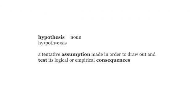
A hypothesis is similar to an assumption. The difference is a hypothesis is designed with a specific purpose – to test the outcome or consequence of the assumption. Is what you are asserting true or false? How will the answer to the question affect the bigger picture?
We use a hypothesis to validate hunches. Testing if you are right or wrong demonstrates a customer-driven mentality. Delivery teams use research and experimentation to verify what they are proposing is the best way forward. It's not about right and wrong; it's about what the user wants as opposed to what you think they need.
Research results tell you whether you understand the user's needs and behaviours when designing and building your products. And more importantly, the insight reveals the broader potential or unseen pitfalls in your product.
Benefits of hypothesis driven design
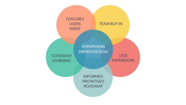
Testing your ideas using hypotheses during the design phase is an effective way to validate assumptions. Here are 5 ways to benefit from hypothesis driven design:

Get team buy in
Get everyone involved in writing hypotheses. Giving everyone on the team a voice in the process creates a sense of ownership.
Less paperwork
Bring everyone along on the journey with you. You’ll create less documentation for people to review.
Informed prioritised roadmap
You’ll create a stronger, evidence-based roadmap using hypothesis-driven design.
Constant learning
Even after a new feature is released, you can continue to use your hypotheses to run further research and discover more insights.
Features users want
Hypothesis driven design produces better solutions. Features that are fit for purpose and solve real needs will create better user experiences.
Writing a hypothesis
There is no prescriptive way to write a hypothesis. Here are 2 subtly different methods I use with great effect. Each method is built up from 3 simple parts.
Outcome-based
- Proposed solution…
- Expected outcome…
- Measure of success…
Here is an example of an outcome-based hypothesis:
If we reduce the number of registration steps down from 3 to 2, we will see an increase in the number of new users registering. We will know this to be true if we see a measured increase in registrations after 4 weeks.
Action-based
- We believe that…
- So if the user…
- Then we will see…
Here is an example of an action-based hypothesis:
We believe we should attempt re-engagement with the user via email after 20 minutes instead of 2 hours, because the user is more likely to still be online and, therefore, more likely interact with the email. If this is true, we will see a measured increase in basket conversions within 4 weeks.
Let your project dictate the kind of hypothesis you write. Although there are numerous ways to choose, you will want to find and use the right method for your project, or a specific problem you are trying to solve.
Don’t be arrogant
Ultimately, we all need to move away from making assumptions that aren’t tested and validated before being implemented, whether on a customer-facing service or an internal organisational project. If that assumption is wrong, it will negatively affect someone or disrupt a critical process.
Please, don’t be arrogant, don’t make assumptions. Instead, hypothesise, test, research, validate, iterate… then implement.
Learn more
Stay up to date with what’s happening at BPDTS by signing up to get our blog posts.
To hear what colleagues from across government are doing, join in the conversation on social media using #ServicesWeek.
Connect with us on LinkedIn, and follow us on Twitter. You can also connect with Phil through LinkedIn.
Thinking of joining us? Have a look at our current job openings.
2 comments
Comment by Lee Head posted on
Nice article Phil. Assumptions are still rife in design work, but we need to design based on evidence.
Comment by Anne-Marie posted on
Wow - absolutely enjoyed this piece Phil.